 Brand Platform Guide
v5.1 · June 2026
Brand Platform Guide
v5.1 · June 2026
Visit Salt Lake
Brand Platform Guide
v5.1
June 2026
Scroll
↓ Scroll to continue
Brand Platform Guide
v5.1 · June 2026
What This Guide Is For
Our brand represents what we stand for and does so broadly to a wide audience. This manual offers a messaging architecture and flexible visual identity system to guide our communications in a way that not only looks and feels cohesive across all touchpoints, but also feels intrinsically "Salt Lake."
Positioning Statement
In Salt Lake, you don't have to choose between city or mountains. You get both.
The mountains frame and surround the city. The roads lead into the canyons. Four world-class ski resorts sit within forty minutes of America's #1 rated international airport, itself only ten minutes from downtown.
America's Mountain City™ is the platform that unites all of Salt Lake and welcomes the world.
Manifesto
"Somewhere along the way, someone decided the city and the mountains were two different destinations. We never accepted that."
The skyline rises between the striking mountains. The grid leads into the canyons. The runway is ten minutes from downtown. Downtown is forty minutes from a chairlift.
In Salt Lake, you don't have to choose between city or mountains. You get both.
We never accepted the trade-off, because we never had to.
This is Salt Lake. America's Mountain City.™
Find the best hotels, restaurants, trails, events, and hidden gems. Immerse yourself in the city where the mountains are never more than a few minutes away.
welcometomountaincity.com →The Opportunity
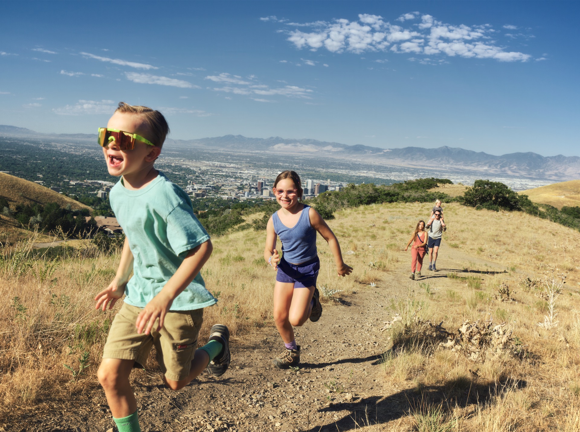
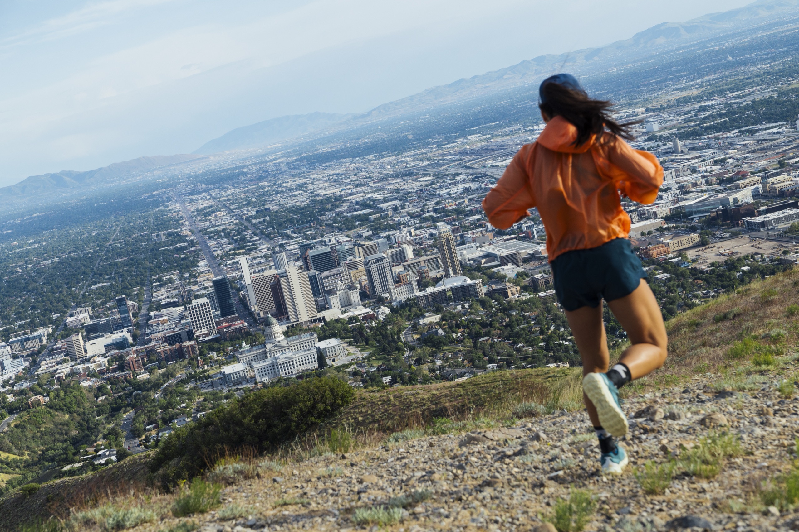
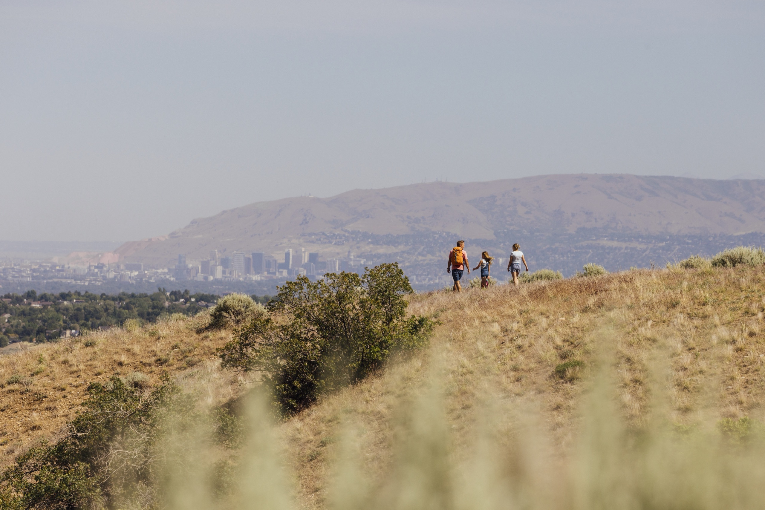
Salt Lake is the only city in America where a world-class urban core exists inside a mountain range. The city and the mountain are the same experience. America's Mountain City™ is how we make that impossible to ignore.
Lead with America's Mountain City™ as the creative platform. It's place-based, instantly visual, and owns something no one else can claim.
Stop telling people Salt Lake is close to the mountains. Prove it. Make the duality feel real and specific, not just a tagline.
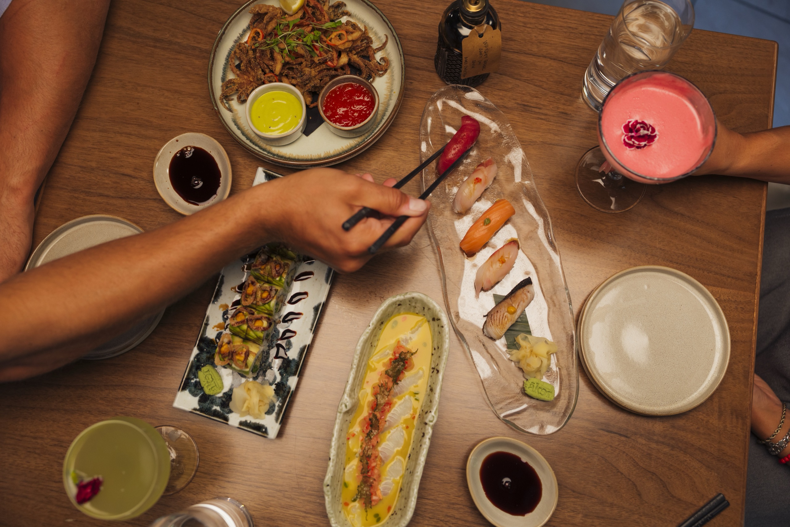
Salt Lake keeps raising its bar. New venues, new teams, new restaurants, a decade of Olympic momentum. Energy is constant here, and there's always a new reason to come experience it.
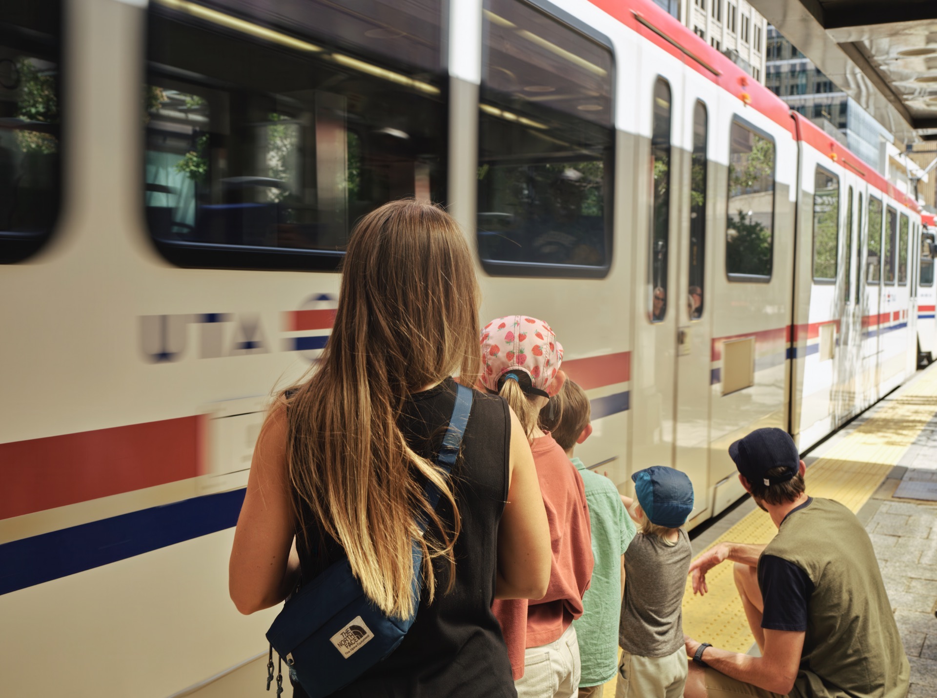
Focus on the audiences with the highest propensity to visit: Families and Urban Explorers.

Three pillars carry the platform. Every piece of work is mappable to one. If creative can't identify which pillar a piece sits on, it's not on-platform.
The structural proof of the platform
Salt Lake is the only place where the city and the mountain are the same experience. No other destination can credibly claim "both at once."
The reason to come back
America's Mountain City™ is nowhere near its final form. The geography is drawing new investment, athletes, restaurants, and the world's attention toward 2034.
The objection-handler that closes the trip
The proximity isn't a marketing claim. It's geography. Every minute saved getting to your activity is a minute that proves the platform claim.
A combination of four tones forming one unified voice. The channel and creative adapt. The voice does not.
The voice that makes the platform claim possible. "America's Mountain City™" only works if the brand says it without second-guessing. Confident allows declarative copy. Even, sometimes, a refusal to qualify.
The texture that keeps confidence from becoming too serious. The unexpected cut, the dry one-liner, the smile inside a contrast, a wink. Most often visible in social.
The voice of the welcome. Locals on camera. The newsletter. Friendly is what keeps the brand from sounding like a press release and makes it approachable and vibrant.
The editorial line that prevents the work from feeling like every other DMO campaign. No overly staged hero shots. No actors pretending to be locals. America's Mountain City™ is a claim residents have to recognize as true.
Confident says it.
Playful keeps it light.
Friendly opens the door.
Genuine makes you trust it.
Color System
Thirteen brand colors spanning cool anchors, warm accents, and neutrals. Every color carries a digital hex, print CMYK, a print-matched hex, and a PANTONE value. In print, use the PMS spot colors for the paper stock. Click any swatch to copy its hex.
Typography
Build hierarchy from Saans' weights: headlines set expectations, subheads organize, body explains. Use spacing as a tool, not an afterthought. Choose alignment by function: left for readability, center for emphasis, right for occasional accents. Don't mix without purpose. Contrast is your best friend: pair sizes, weights, and colors that feel different enough to guide attention.
Logo System
The master brand speaks as the organization. The platform lockup adds the America's Mountain City™ tag and carries the campaign. Both download in vector and raster: the master mark in SVG, PNG, EPS, and JPG; the platform lockup in PNG, JPG, and EPS.

The organizational master brand: the mark without the platform tag. Lead with this when Visit Salt Lake speaks as the organization: partner agreements, sponsorship credits, recruitment, corporate, and internal communications.
Download · Horizontal · White

The campaign platform lockup: the master mark with the America's Mountain City™ tag locked beneath it. Use on outbound destination marketing and campaign creative wherever the platform is the message. Never reconstruct the tag from type.
Download · Horizontal · White
Anatomy & orientation

The horizontal lockup is the primary mark and the most versatile brand asset. The stacked vertical lockup is secondary, for contexts where a taller format is preferred.
Variations · the exception, not the rule


Approved color combinations
High-contrast pairings for maximum accessibility and legibility. Use these as a guide for web and digital design: every combination clears contrast standards for readers with visual impairments.

Usage Rules
Do
Don't
Brand Governance
Clearspace, sizing, misuse, color accessibility, co-branding, and trademark: the operating manual for every vendor, agency, and employee who touches the brand. Pick a topic.
Nothing enters the clearspace zone: no copy, no imagery, no other marks, no decorative elements. The unit x is the cap height of the wordmark at any given size and scales proportionally with the logo.

x = cap height of the "V" in "Visit." At 280px logo width, x is roughly 22px.
The AMC tag has no clearspace of its own. Treat the full lockup as one unit.
| Lockup | Min. Print | Min. Digital | Note |
|---|---|---|---|
| Vertical / Stacked (Primary) Salt Crystal Icon above the stacked wordmark | 0.5″ tall | ~48 px tall | The primary mark. Use wherever space allows. |
| Horizontal (Secondary) Salt Crystal Icon left of the wordmark | 1.5″ wide | ~144 px wide | For limited or wide spaces only. |
Official minimums are set in inches for print (0.5″ tall stacked, 1.5″ wide horizontal); digital equivalents shown at 96 dpi. Below these sizes the wordmark loses legibility.
Every violation below has happened in the wild. These are the six most common mistakes made with destination brand marks. When in doubt, use the approved source file unchanged.
Scale proportionally from a corner handle, never width or height alone. Distorting the aspect ratio breaks the mountain mark and the letter spacing at the same time.
The mark always sits level. No tilt for energy, no angle for dynamism. If a layout demands rotation, the layout is wrong, not the mark.
No drop shadows, glows, gradients, bevels, or emboss. If the logo isn't legible on the background as-is, fix the background: adjust the overlay, change the crop, or change the color.
The mark appears only on Mountain Navy, Cream, Ink Black, or photography with a minimum 50% overlay. Marigold, coral, rust, sky, and meadow are not approved logo backgrounds: contrast is insufficient and the accent competes with the mark.
On photography or multi-color backgrounds, apply a dark or light overlay at a minimum 50% opacity before placing the mark. White mark on dark overlay; black mark on light overlay.
The filled version is reserved for specific production contexts. The outline mark is the primary mark for digital, print, and campaign creative. Never substitute the fill as a default alternative to the outline.
VSL co-brands with hotels, airlines, event partners, and sports franchises. The America's Mountain City™ mark is always the organizing brand, never an equal partner.
AMC is always primary. The partner mark sits to the right of a 1px rule, sized to match visual weight rather than pixel height. When uncertain, the partner mark should read slightly lighter.
For visitor guides, co-op ads, and event collateral, use the platform lockup rather than the master mark. The AMC tag carries the campaign narrative into the partnership.
The AMC or platform mark is never smaller than the partner mark. Target the partner at 70 to 80% of AMC's visual weight. When evaluating, squint: the AMC mark should still read first.
A 1px vertical rule (cream on dark backgrounds, navy on light) always separates the two marks. Minimum height: the cap height of the partner wordmark times two. No rule, no co-brand.
Never a three-logo lockup. If a sponsor requires their logo plus an event logo plus AMC, group the event and sponsor separately from the AMC mark. They do not share the divider.
Co-brand lockups appear on Mountain Navy, Cream, Ink Black, or photography with a minimum 50% dark overlay. Never on partner-brand colors, unbranded neutrals, or patterned backgrounds.
America's Mountain City™ is a protected trademark of Visit Salt Lake. Four rules govern its use in copy. Follow them in all partner materials, press releases, and third-party placements.
"America's Mountain City™ is the platform that unites Salt Lake."
The ™ is an essential part of the tagline and always appears, whether it is locked up with the logo, set as a headline, written in body copy, or used in a CTA. There is no "first reference only" exception: every appearance of the phrase carries the ™. Set it as a superscript at the same weight as the surrounding text; never reposition or resize it by hand.
"America's Mountain City™" not "AMERICA'S MOUNTAIN CITY"
The tagline is always treated in title case to keep it approachable and natural. Never set it in all caps, even in headlines, labels, or eyebrows where the surrounding type is uppercase.
"Welcome to America's Mountain City™"
Do not shorten ("Mountain City"), alter ("the Mountain City"), or possessivize it ("America's Mountain City's..."). "America's Mountain City experience" is acceptable; "the Mountain City" is not. It is a trademark, not a descriptor.
When in doubt, ask first. Partner materials, press releases, and third-party placements using the mark should be reviewed by VSL's marketing team before publication. Misuse in partner materials reflects on the brand even when VSL is not the publisher.
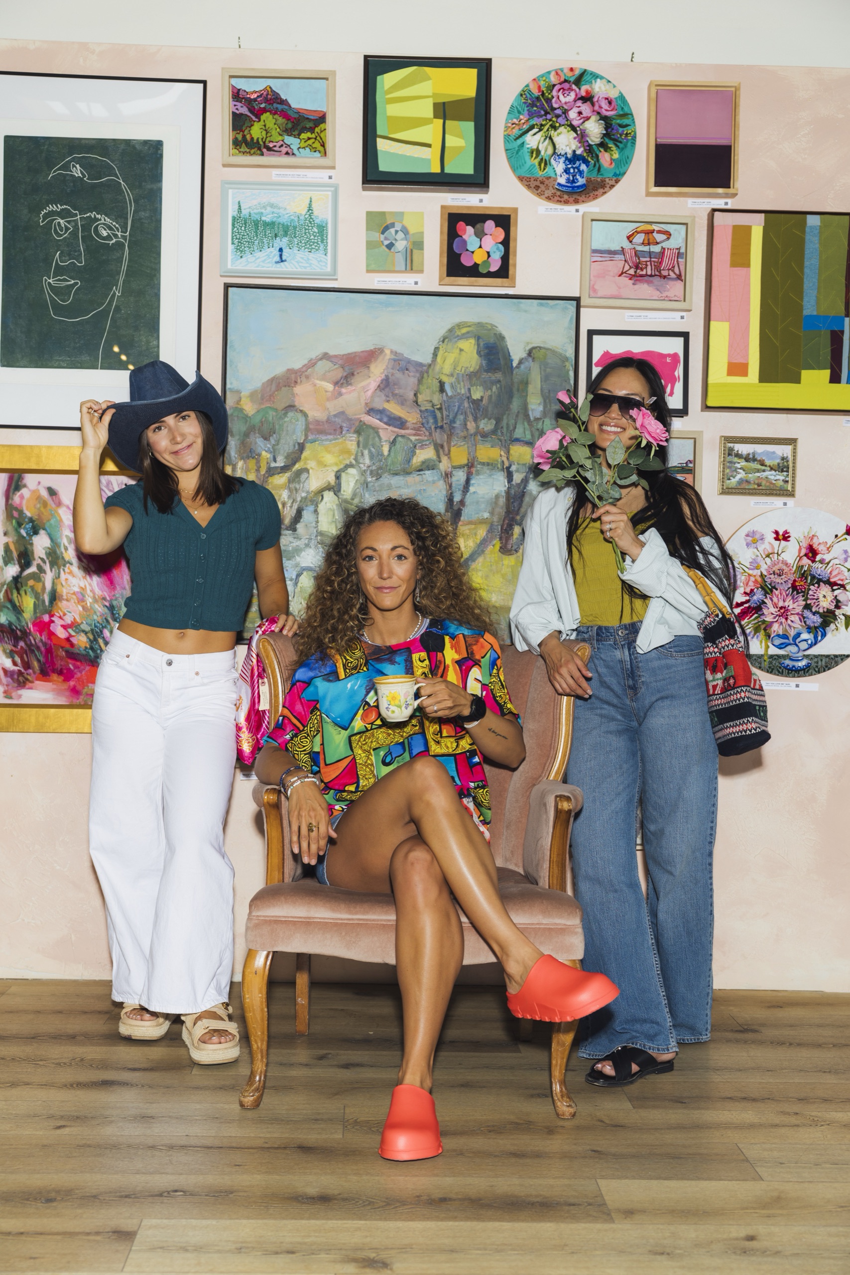
Photography
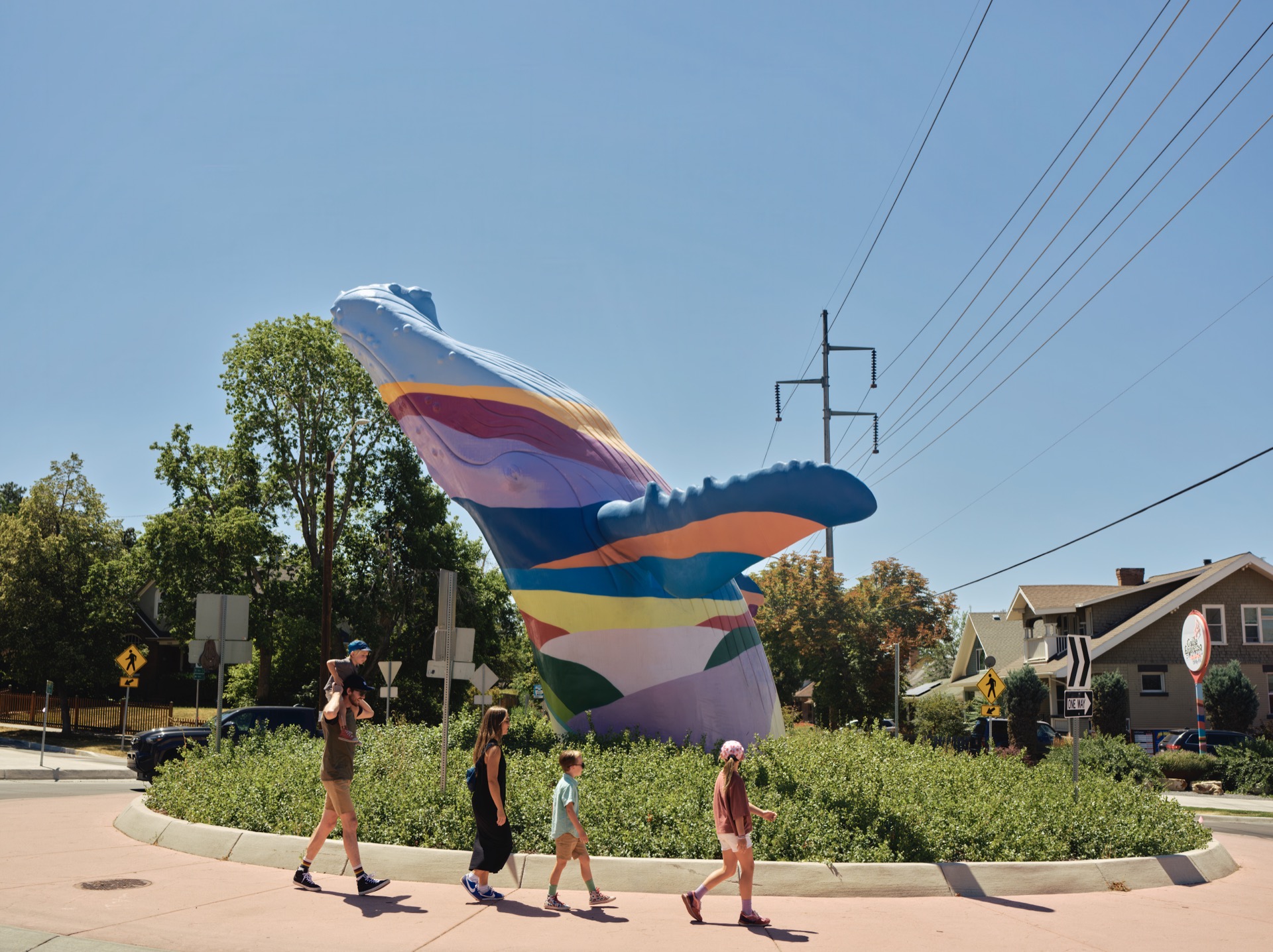
Our photography puts Salt Lake's defining tension on display: a real city with world-class outdoor access, minutes apart. Every image should make that proximity feel visceral.
Brand Kit
Everything you need to put America's Mountain City™ to work: logos, typefaces, 150 campaign photos, and brand videos. Download the whole kit or grab exactly what you need.
Everything

Master Logo · Primary Horizontal
Logos
Typeface · Primary Sans
Typeface · Editorial Serif
Typefaces · Bundle
Photography · Web
Photography · Print
Brand Videos
The anthem and video spots, ready for broadcast, paid media, and social. Watch the 16:9 cut before you pick your length, ratio, and resolution.
All assets are cleared for partner and press use under the America's Mountain City™ brand. Keep clear space and approved color combinations intact. See Logo Usage and Color above.
Enter your email to access this download. You'll only need to do this once.
